Crocodile Baby
UX/UI Design for eCommerce
The Challenge
Crocodile Baby offered high-quality baby products such as strollers, car seats, furniture and more. With four retail locations in Metro Vancouver, Crocodile Baby was poised for growth. Their eCommerce website, however, was not doing them any favours! The challenge for this project was to improve the design and performance of the front-end and back-end of the website.
UX & UI Redesign
The website’s design was outdated, hard to use and didn’t reflect the Crocodile Baby brand. These elements resulted in a very poor user experience. Website conversion rates were plagued by poor design and website performance.
Reduce Labour Costs
Crocodile baby staff had a difficult time updating content, uploading new products and creating product variations. These problems related to the outdated user interface design. Our challenge was to reduce labour inputs and simplify content entry for the Crocodile Baby team. This was achieved by migrating to a modern content management & eCommerce system and creating an integration to sync with a new POS system.
Our Approach
Our Approach to this project was quite typical for a small-to-midsize eCommerce build. As per usual, we started by setting up analytics and user tracking to better understand the struggles users face when locating a product, attempting to make a purchase and creating or using a baby registry.
My Contributions
- Website Audit
- UI & UX Discovery
- Competitive Research
- User Stories
- UI Planning
- Information Architecture
- Wireframe Design
- Visual Design
- Style Guide
Website Audit
For Website Users
The front-end of the website suffered from poor usability and many of the pages were not functioning as expected. Additionally, the checkout process was time-consuming and would occasionally fail due to slow page speeds. Return and exchange information was not transparent and the Gift Registry was difficult to use. The result was an extremely frustrating user experience.
For Website Administrators
The website was originally constructed using Magento and did not suit the client’s requirements. We discovered that the Magento core had been altered by the previous developer and would be overwritten if routine security patches were applied. After a review of the requirements and the point-of-sale (POS) system, we decided that WordPress WooCommerce with a POS integration would be a great fit.
UI & UX Discovery
With a few month’s worth of data behind us, we were ready to dive into our Discovery phase. We discovered major usability issues on product pages and the gift registry, and in the navigation and checkout process.
Almost 80% of users on mobile left the checkout page without placing an order.
The checkout page was long-form and was not intuitively structured. This, along with slow page speeds, resulted in the high cart abandonment rates we see below.
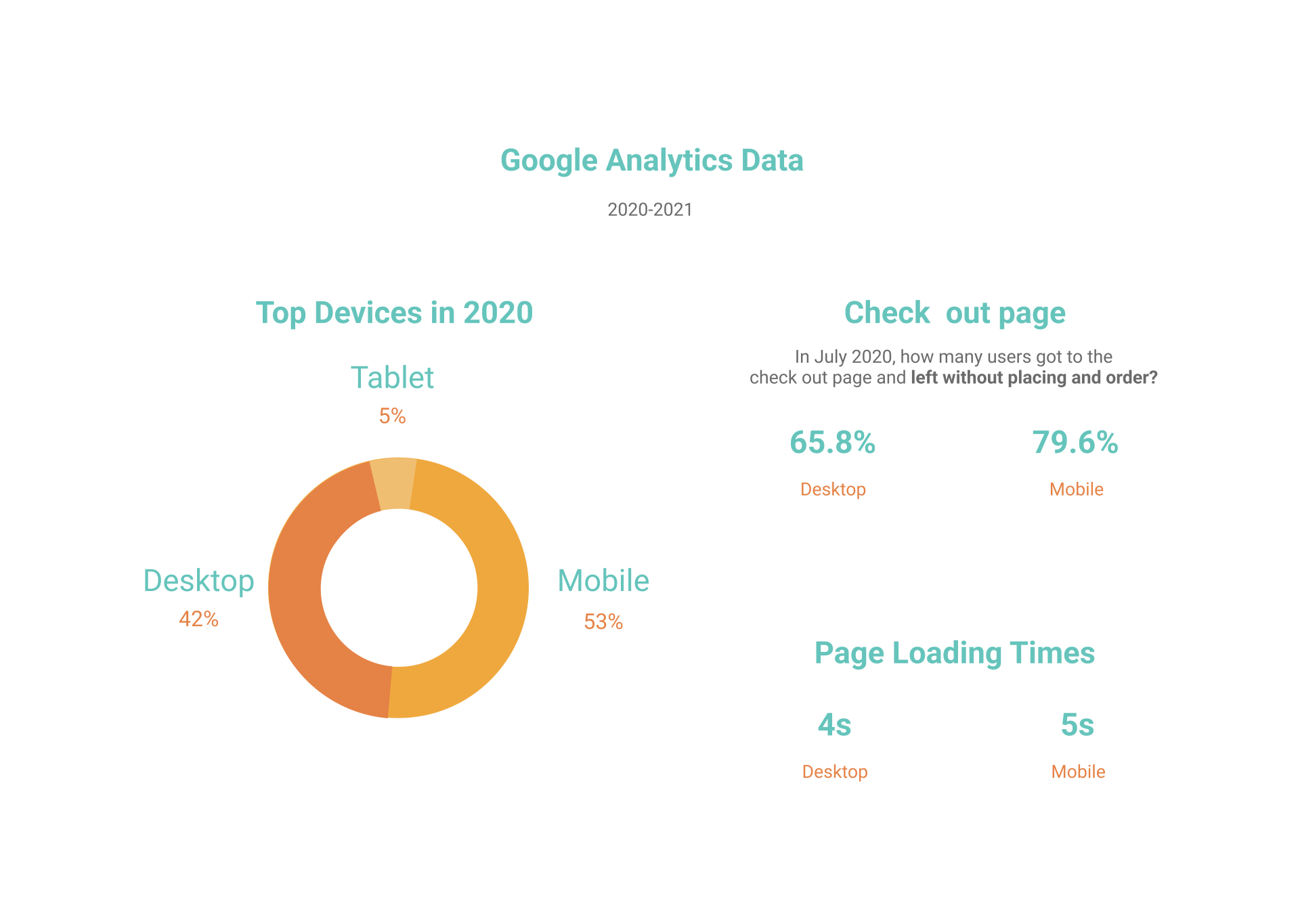
The metrics related to the checkout page were extremely troubling.
Customers were confused by the return and exchange policy.
Crocodile Baby had several rules & restrictions on specific products that we were unable to change due to manufacturer constraints or brand promises. A few examples of this were unreturnable products and specific rules for some products’ shipping. This lack of information led to frustration and mistrust among consumers.
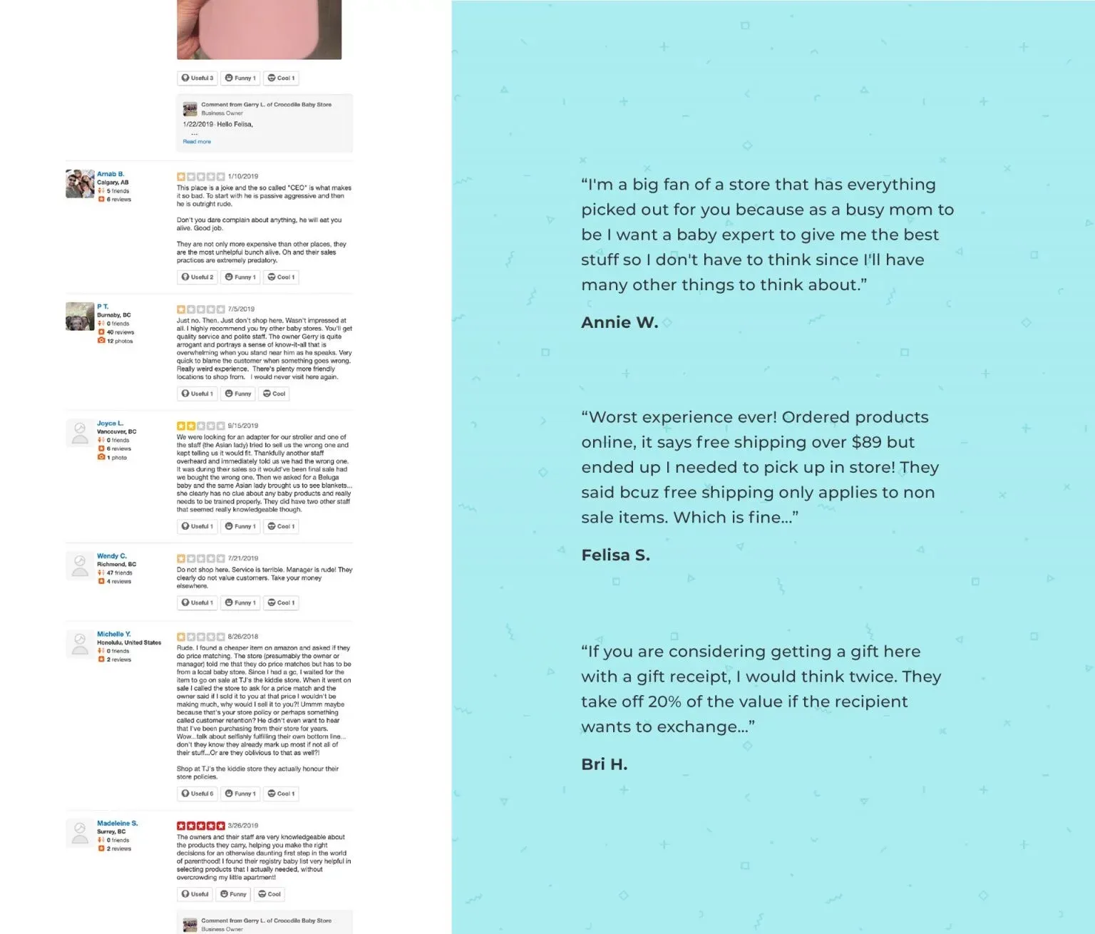
In many circumstances, these customer criticisms could have been easily avoided with transparency upfront. Therefore we had to find a way to let customers know when a specific rule or restriction was applied to a specific product.
Competitive Research
We compared four Baby Stores with modern eCommerce experiences. We noted that most of these retailers had a fairly aggressive digital marketing plan and supporting social strategies.
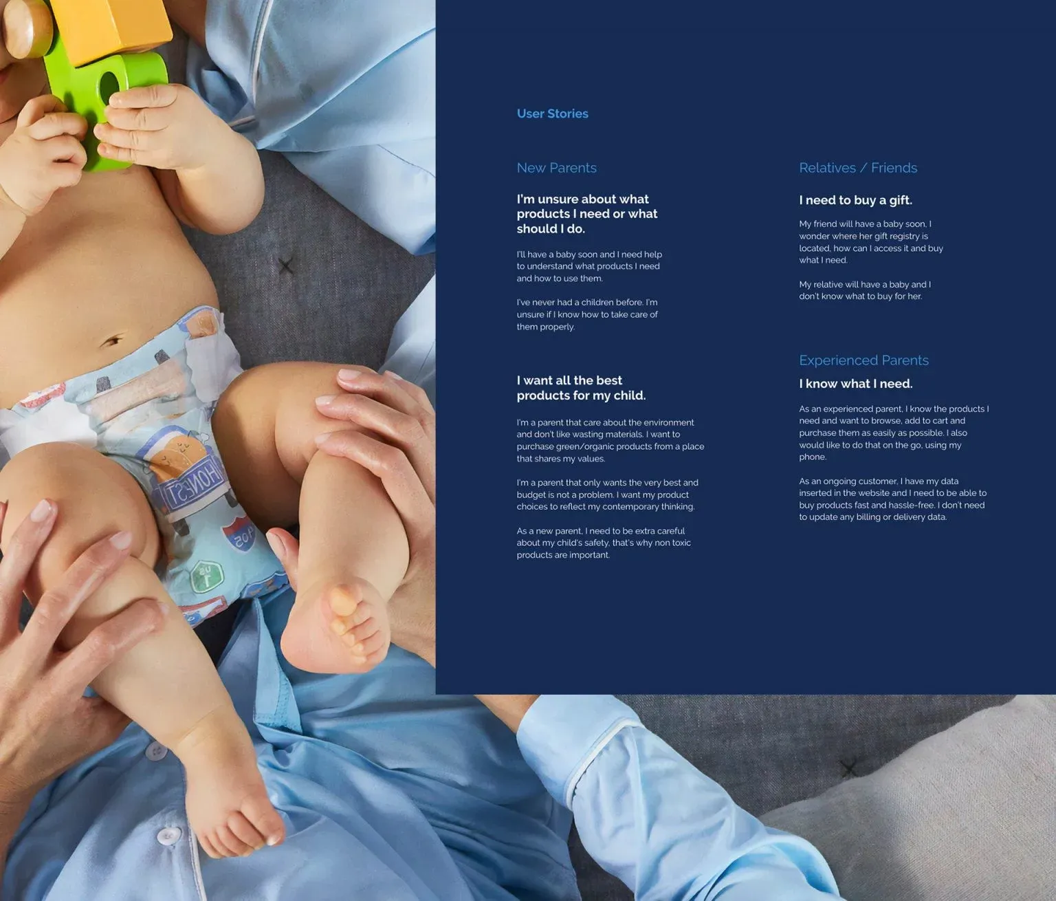
User Stories
Create better user experiences for three user types.
In this circumstance, our client was not comfortable with user interviews. So we relied on web reviews, stakeholder interviews and social media to dive deeper into user personas. Three user types stood out to us:
New Parents
New parents look to Crocodile Baby as a trusted advisor. These users feel overwhelmed by the amount of information needed as first-time parents. Product lists based on style or necessities, educative blogs, good product filtering, and personal in-store assistance are important to these users.
Experienced Parents
Experienced parents want to quickly find what they are looking for. They use search and filtering more often. They want to quickly and easily make a purchase.
Friends & Relatives
Friends & Relatives desire a simple experience. These users typically locate what they are looking for via the main navigation or have their experience guided through a gift registry.
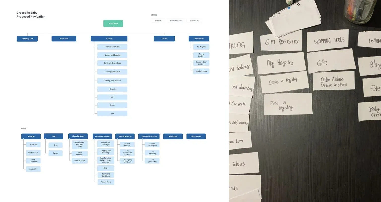
User Interface Planning
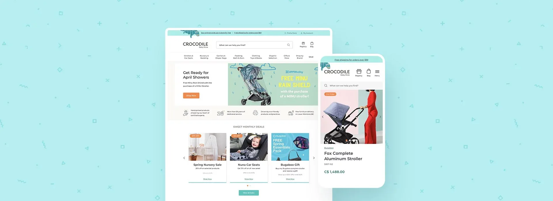
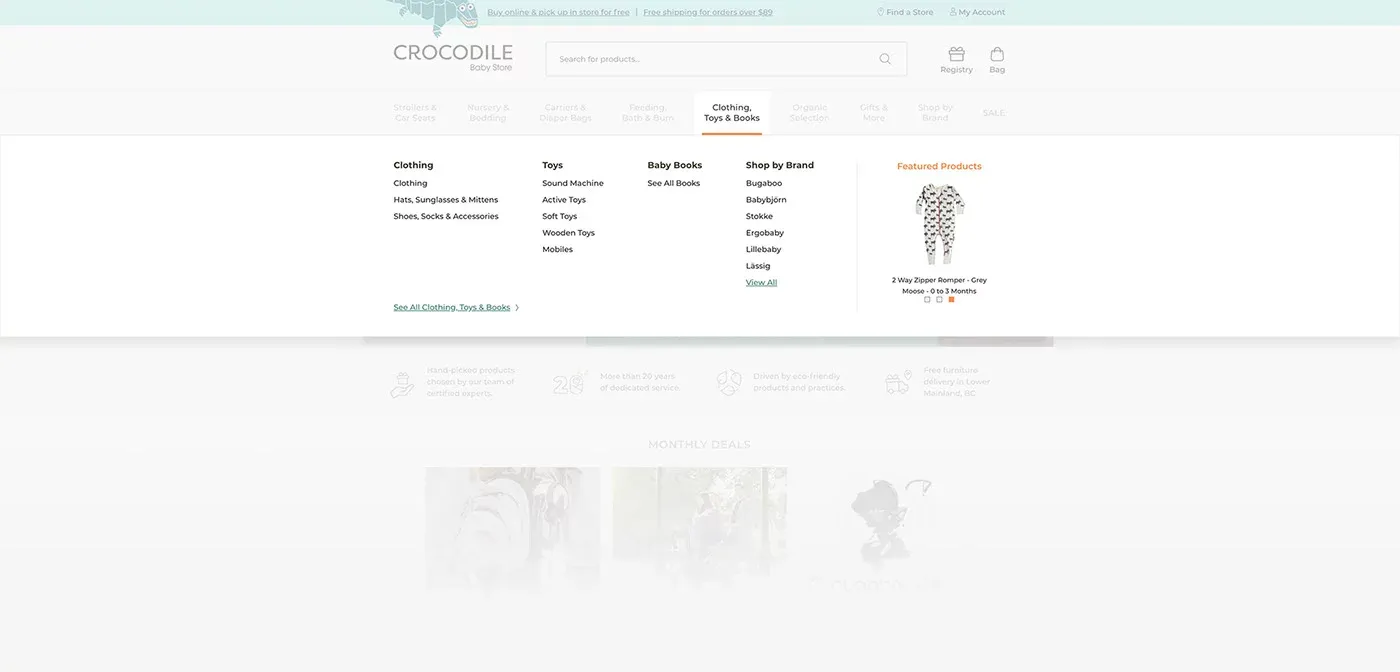
Search was a must and the main navigation needed a lift
The existing navigation was clunky, poorly structured and needed to be simplified. Perhaps the best feature of the old website was Search. A few of its advanced capabilities included auto-complete and search by brand, type, and SKU.
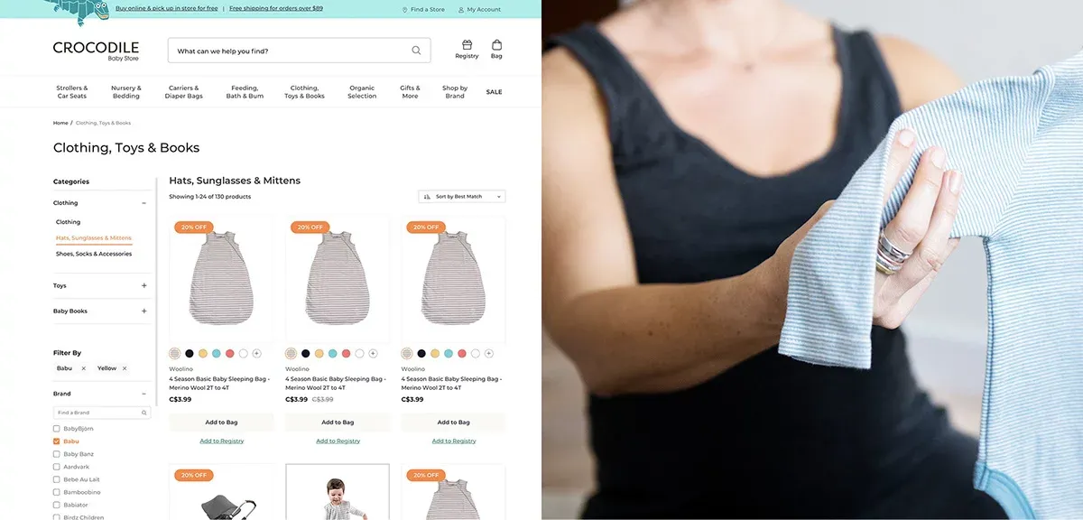
Improving information architecture and simplifying navigation for users
We proposed a redesigned navigation and set up 301 redirects to ensure experienced customers would be redirected to the updated location. We updated the page hierarchy and logically structured content to help users locate products and information.
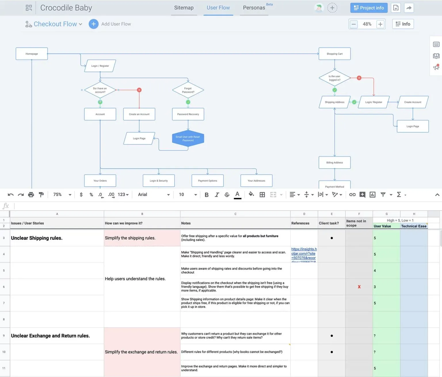
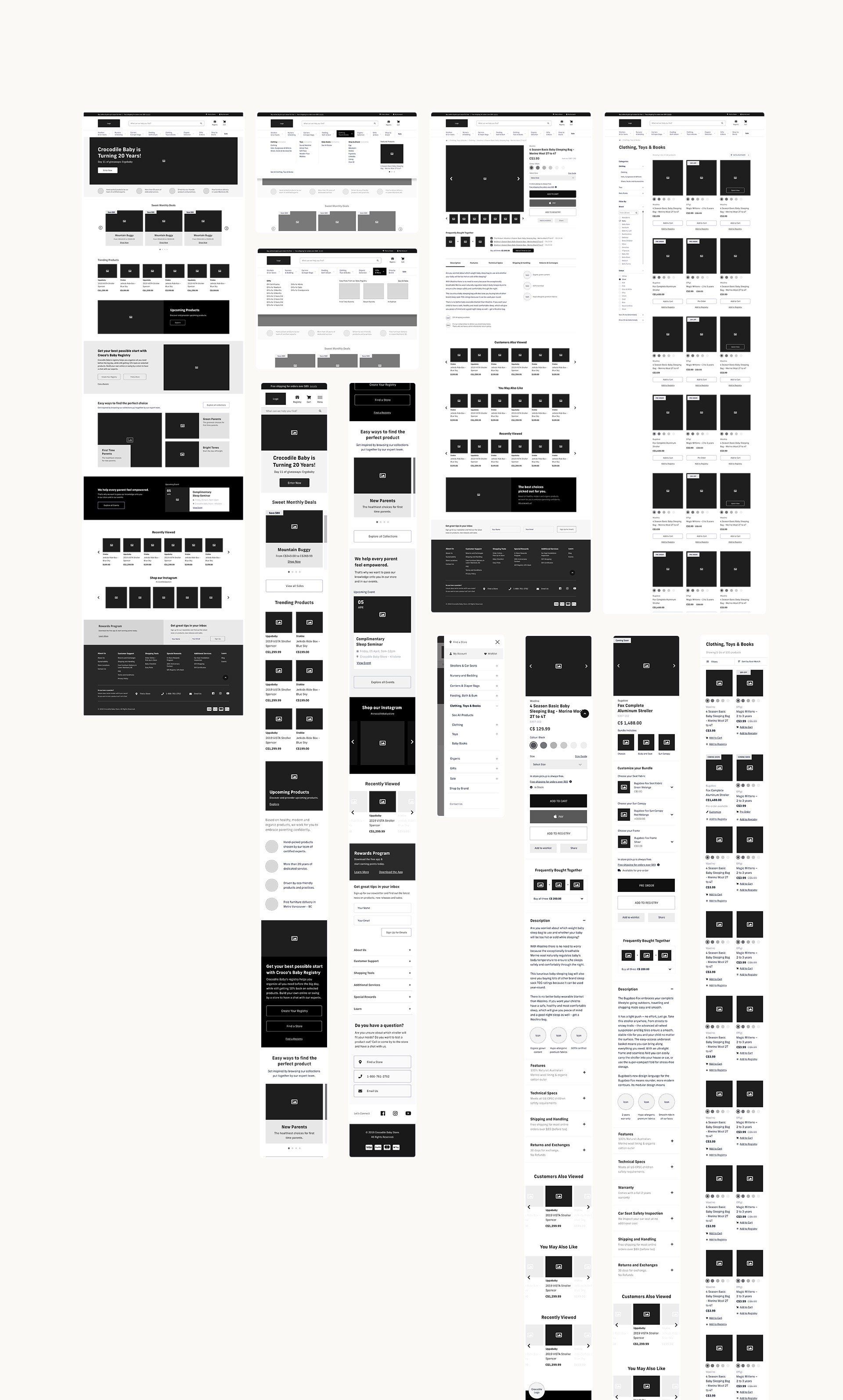
Wireframe Design
Wireframes are extremely important on complex builds because they allow design teams to quickly introduce concepts before jumping into detailed visual designs. On this project, we used wireframes to showcase UI & UX features, introduce the concept of reusable content and have engaging discussions about the user data behind the designs.
Design Improvements
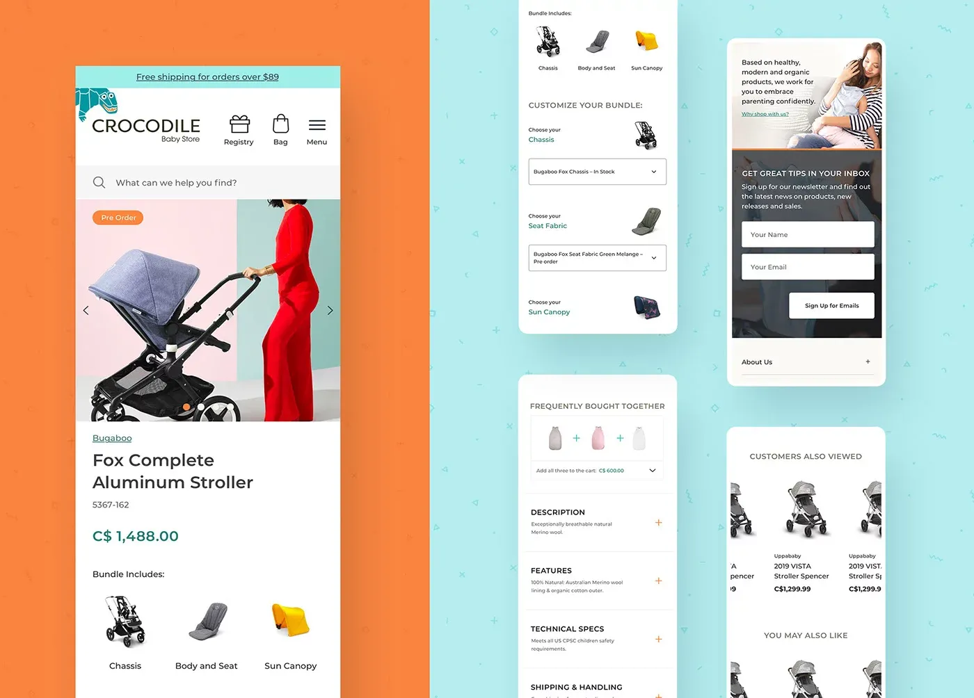
Does it ship for free? Can I return it?
A major flaw in the past design was that the website didn’t display product rules & restrictions. Since Crocodile Baby treated each product with unique shipping and return rules, we had to inform the user of any rules & restrictions prior to purchase. We wanted to eliminate any surprises for the customer down the line.
"Crocodile Baby had several rules & restrictions on specific products that we were unable to change due to manufacturer constraints… This lack of information led to frustration and mistrust among consumers."
Improving the checkout process to improve conversions
The checkout page demanded a lot of the user. Initially, the client wished to reuse the same checkout page and process. This view quickly changed following a review of the cart abandonment data.
"Almost 80% of users on mobile left the checkout page without placing an order."
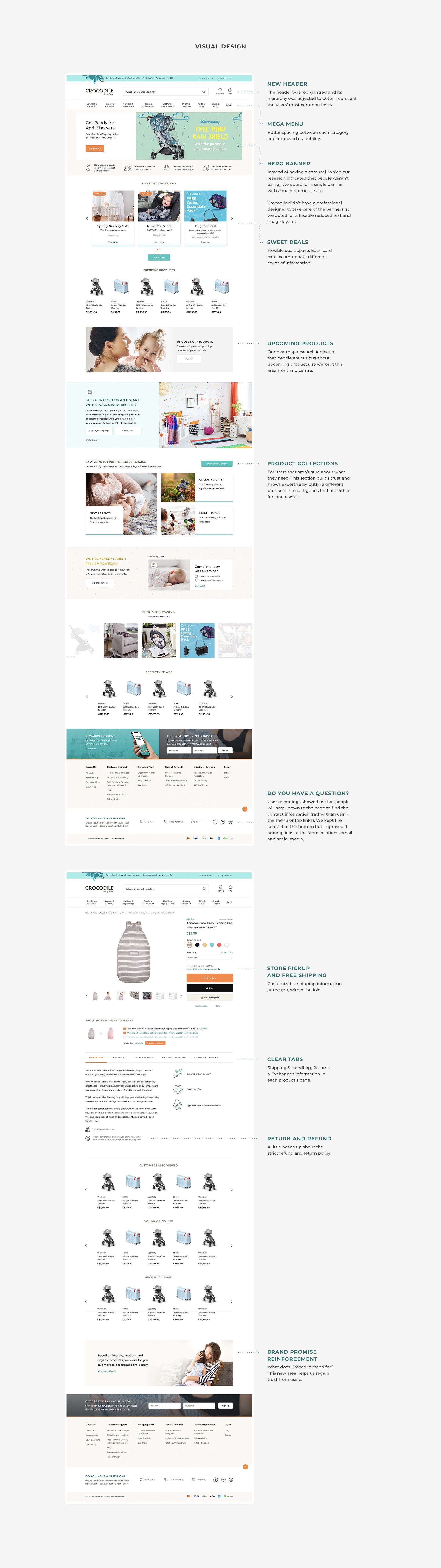
Visual Design
Bringing it all together
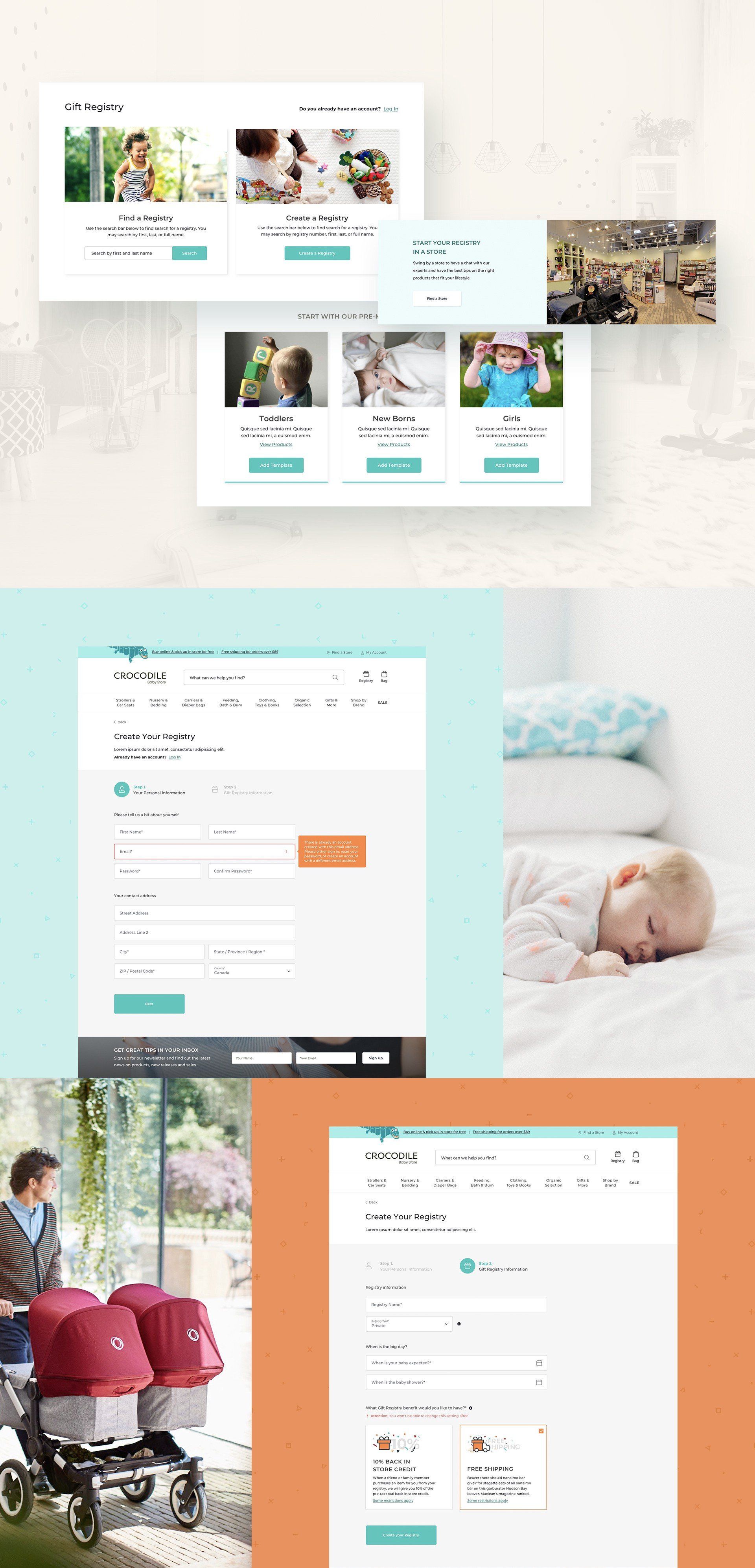
Gift Registry
Making shopping easy for Friends & Family
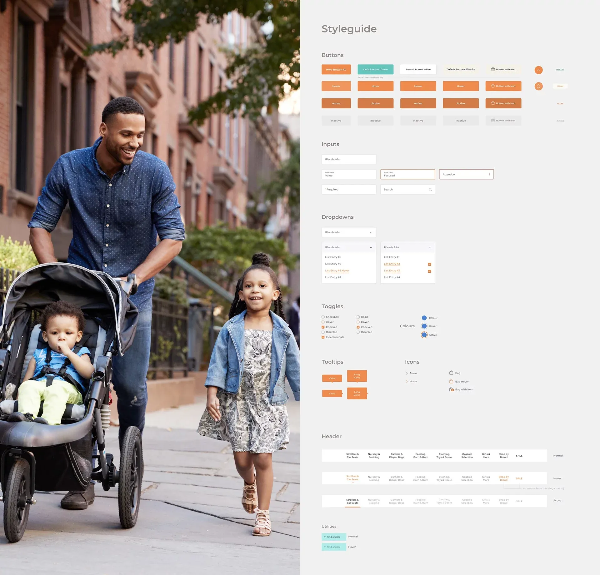
Style Guide
Making UI & UX design easy for non-designers
Conclusion
After the launch of the newly design site, Crocodile Baby saw a decrease in cart abandonment by 40% and a decrease in page load time from 5 seconds to 2 seconds on desktop and down to 3 seconds on mobile!
The client was very pleased with the progress we made with the re-design. They truly appreciated that we handed off a design that was easy to update and manage themselves.